We have researched horror films titles and the art of them however we have not yet looked at the transitions used to display the title.
These are film titles that look professional and carry the horror conventions:
The Village- Title sequence starts at 2.04
The use of the colour red connotes blood and danger which automatically meets the conventions of the genre horror and warns the audience that the film will include more death and gore.
Also the title uses a transition which looks like ink sinking through paper, this type of effect is eerie as it makes the title look like it is creeping up on the screen, which could foreshadow the creeping and stalking themes throughout the film. Also the background looks like old fashioned paper which highlights the era the film is set.
The Exorcist-1973
The genre horror has changed dramatically over the years as film has become more technologically advanced therefore this has effected the title sequence.
The exorcist is a prime example of a horror film that was seen to be the scariest movie in 1973 therefore I think it is important that I look at it's title sequence.
The title sequence comes right at the end of the trailer this is a common convention in horror film trailers. The Title is simple however it still portrays a horror genre without the effects used today. The fade out then the fade in in black keeps the audience tense as they are waiting for something to appear on the screen, this editing makes the title stand out. Also the colour black is a conventional colour on the genre horror this is because it connotes to danger, suspicion and misery which are all elements and themes presented in The Exorcist. The big bold sans serif red letters in the title stand out against the black background connoting blood, death and violence. Also the sans serif font makes the title more sincere and threatening rather than serif which often looks personal.
Paranormal activity 2 -2010
After looking at an old classic trailer to research the titles, I thought I should look at a new trailer sequence which has used effects on the titles. This film is a sequel however I looked at the first Paranormal activity trailer also and the producer has stuck with the a very similar title sequence.
The title sequence is at the end of the trailer which complies with the conventional horror trailers. The transition before the title is like an old television screen turning off, then the non diegetic sound is like an electric current buzzing as the number 2 flickers on and off in a flourescent white colour on the black background. This colour scheme makes the title look like an x-ray which has connotations to bones which has a connotations of death, the supernatural and the human body which most people can relate to, therefore creating this verisimilitude feel which threatens the audience as they feel it could happen to them. Then as the 2 stops flicking the words Paranormal and activity flicker on and off, the flickering fuzzing non diegetic sound makes the audience weary as conventionally loud music would set in and make the audience jump. However, this does not happen here, leaving the audience wanting more. This title uses the flickering of the white font on the black background to make the title stand out also the 2 is more significant as it stops flickering this makes it clear to the audience that the trailer is for a sequel, however it keeps to the same themed title sequence as the first one so it is unique and remembrable.
Saturday, 30 October 2010
Thursday, 28 October 2010
Resit - Why we chose to re-film a new idea?
When looking back at our previous horror trailer we felt we had tried to put too much information in, with introducing too many shots and introducing too many characters. This is not conventional for the horror genre, and we did not think our trailer was scary, we were happy with the music as it was eerie. However, there was no murder shown and this could be quite confusing. Also after feedback we found that the audience did not understand the storyline, this was a big issue as trailers should be simple and easy to understand however ours was too complex.
We still wanted to stick to the same stalking theme but we wanted to change the male character. We thought of realistic stalking instances in our initial ideas mind map, and found the theme love and relationship is usually a starting point in stalking. We wanted to keep the same vulnerable yet twisted antagonist Katie so we thought if the idea that her boyfriend split up with her and cheated on her therefore she seeks revenge and kills all the girls he has been seen with. In our trailer we do not want it to be obvious why Katie wants revenge and we want the audience to be active and think why might she be stalking Chris and why she kills the girl he is seen with. We want to leave the trailer on a cliff hanger so the audience want to watch the film and find out to what extent does Katie go off on a murdering rampage.
We still wanted to stick to the same stalking theme but we wanted to change the male character. We thought of realistic stalking instances in our initial ideas mind map, and found the theme love and relationship is usually a starting point in stalking. We wanted to keep the same vulnerable yet twisted antagonist Katie so we thought if the idea that her boyfriend split up with her and cheated on her therefore she seeks revenge and kills all the girls he has been seen with. In our trailer we do not want it to be obvious why Katie wants revenge and we want the audience to be active and think why might she be stalking Chris and why she kills the girl he is seen with. We want to leave the trailer on a cliff hanger so the audience want to watch the film and find out to what extent does Katie go off on a murdering rampage.
Resit - Location Scouting
Hylands Park

We liked this because it is an open space which is common in most horror films. The open spaces create tension within the audience and leave them guessing as to what will happen to the antagonist next.

This would be effective as it is dark and this is often used to create a sense of panic and entrapment.


This is a totem pole which stands in the newly developed part of Hylands park, totem poles represent worship which draws connotations to obsession and stalking which are key themes we are going to look into.


We liked this because it is an open space which is common in most horror films. The open spaces create tension within the audience and leave them guessing as to what will happen to the antagonist next.

This would be effective as it is dark and this is often used to create a sense of panic and entrapment.

This part of Hylands Park would look extremely scary if we filmed in the dark, especially by this section with the water. The water could connote self identity and reflection which is often a theme in horror films. Also the wall and greenery complies with the conventions of entrapment and nature which are key elements in horror films also.

This is a totem pole which stands in the newly developed part of Hylands park, totem poles represent worship which draws connotations to obsession and stalking which are key themes we are going to look into.

As we like the idea of having an alleyway within our piece as Jenni will follow the other girl to attack her. We could use this as the trees bend over and make the space look small.


This bench stood out to me because it denotes isolated which is a theme which reoccurs in horror films. Also the bricks denote grey which connotes dull and depressing which are emotions our character will be feeling.

Although the palm tree does not fit the horror conventions it may however be ironic and because it is in the centre of the circle it could be related to a shrine-like symbol where the antagonist sits around it to think about evil plans.


Horror films often use significant locations for certain elements in the location. For example Hylands Park has this gate which looks interesting and it denotes twisted metal, which connotes twisted personality. Making the antagonist look evil and twisted. Also the gate is heavy therefore when it opens and closes it makes a loud screeching noise which would complies with the high pitched sound effects used in horror films.

Again, we could use this narrow path as an alleyway.


Great Leighs Forest


Although the palm tree does not fit the horror conventions it may however be ironic and because it is in the centre of the circle it could be related to a shrine-like symbol where the antagonist sits around it to think about evil plans.


Horror films often use significant locations for certain elements in the location. For example Hylands Park has this gate which looks interesting and it denotes twisted metal, which connotes twisted personality. Making the antagonist look evil and twisted. Also the gate is heavy therefore when it opens and closes it makes a loud screeching noise which would complies with the high pitched sound effects used in horror films.

Again, we could use this narrow path as an alleyway.


Felsted Lake
We could use this location as we would like to have a tree as our main setting for our character to create her shrine. The tree needs to bold and be old to look effective and overpowering. The light here is filtered through the trees so a shadow is always cast and this adds to the eerie feel we wish to create.

We thought the lake would be effective as it is wide and open. Everything reflects off the water and can connote reflecting our characters anguish. It is also a common setting in films for the love aspect of the genre. The wide lake here would make our character look vulnerable as there is nowhere for her to hide.

Wide open spaces are common in horror films and we think this field could be suitable as you can see all your surroundings.
Great Leighs Forest

Resit - Initial Ideas Sophie Tindall + Jo Peplow-Revell
We decided to put our ideas and decisions into a video clip with a voiceover. We researched different horror films on 'youtube' to then print screen the aspects we liked about them to then discuss and continue to plan what we would like to include within our horror film.
We split the photographs of the screenshots into different categories that we think were relevant; stalking, setting, titles, love and other significant details. Together, we agreed these were the recurring themes we found in horror films and would make ours believeable if we followed these themes.
The programme we used was iMovie. Furthermore, we also wrote our own scripts where we contributed ideas to each section.


Sophie Tindall + Jo Peplow-Revell Re-sit Initial Ideas
Here are our initial ideas.

We looked into the theme of love. Looking into the emotions involved with love; such as jealousy, happiness and also sadness. There is also the aspect of the breakdown of a relationship and this can lead to misery and in many horror films, the element of stalking often occurs.

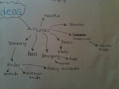
Another element we agreed was in horror films was murder. We looked into the props we could use to portray this and we thought of knives, what type of knives we could use that would be realistic and if we used them how easily accessible they would be to the murderer to keep it realistic.

Following the theme of love, we discussed the theme of stalking. We looked into what causes the antagonist to stalk or follow the protaganist; such as isolation and love. The settings we considered nature, for example. As it is often dark and damp and would connote and reflect the feelings involved.

Another element we considered was revenge. We thought of the situations that might occur to lead to the character wanting revenge.

We looked into the theme of love. Looking into the emotions involved with love; such as jealousy, happiness and also sadness. There is also the aspect of the breakdown of a relationship and this can lead to misery and in many horror films, the element of stalking often occurs.

Another element we agreed was in horror films was murder. We looked into the props we could use to portray this and we thought of knives, what type of knives we could use that would be realistic and if we used them how easily accessible they would be to the murderer to keep it realistic.
Following the theme of love, we discussed the theme of stalking. We looked into what causes the antagonist to stalk or follow the protaganist; such as isolation and love. The settings we considered nature, for example. As it is often dark and damp and would connote and reflect the feelings involved.

Another element we considered was revenge. We thought of the situations that might occur to lead to the character wanting revenge.

Sophie Tindall + Jo Peplow-Revell Re-sit for G321
We are re-sitting our G321 coursework from AS year. Following this post will be all our re-sit work.
Subscribe to:
Comments (Atom)