Final Script
This is the final script for the opening of our film. The first draft was only the script for the dialogue in the opening so the script had to be extended to show all of the scenes in the opening. We have used a professional script layout, with the description of the location, the characters in the scene, the way they are acting or they way they are talking and their movements if necessary.
Tuesday, 30 November 2010
Sunday, 28 November 2010
Resit - First draft of the script
Script
This is the first draft if the script, it is only the dialogue, the final script will have all of the scenes on it.
Saturday, 27 November 2010
Resit Animatic Storyboard
This is the animatic storyboard. I filmed the storyboard speaking over it with details which were not included on the storyboard to show a wider knowledge for why we chose these certain shots.
Friday, 26 November 2010
Resit - Final Location
This is the location we decided to film at: Field House, Wheelers Hill, Little Waltham. This destination is close and not too far from school or our houses so it was easy to get to and back from. The location is the back corner of one of the sections of the garden and it is surrounded by fence. This could connote the entrapement Katie feels within her own mind, and this is common in other psychological thrillers. It is surrounded by lots of trees, bushes and shrubbery therefore Katie would be hidden from anyone else, and this is a reflection of her character - secretive and hidden.
This is the corner and in this picture you can see the tree we used for our pictures also. The floor had leaves which had fallen off the tree so it created our desired sound of crunching leaves to denote her isolation and also the trees would be bare. This connotes the nakedness Katie feels without Chris.

This is where we will take our panning shot. It is a wide open space which we always see recurring within horror films. The wide open space creates suspense for the audience as we think nothing can happen, but something is always hidden. It also connotes how Katie isolated Katie feels.

This will be the alley Katie will drag Annie's body. The leaves are on the floor so it will create the desired diegetic sound and will sound effective. The trees here bend over slightly inclosing the space considerably and this can connote that Katie has done is dawning on her as she is dragging the body and is panicking about the consequence.

Resit - Similar Media Works
Similar Media Works New
Our re-sit slides are white with red font, the red background is all our original work.
Our re-sit slides are white with red font, the red background is all our original work.
Resit Final Shot list
Shot List Resit
This is the final shot list, the difference between the first shot list and this final one is that this shot list has got an added shot. We decided that we needed a final shot that left the audience knowing what Katie's plan is for the rest of the film. So we added the shot of her stroking Chris's face which implies he is her next victim as she seeks revenge.
Resit - First Shotlist
Shot List Resit 1
This is a detailed shot list, the shot list includes the important main details such as the time, date, location, actors and equipment. It also has the details of costumes needed and justifications for the shots and for the costume. This is so that whoever picked up the shot list would clearly understand what we are aiming for and the connotations we want.
Despite saving this document in different formats and trying to change the font size and document size I still can not get on scribd in the correct neat format. However, the tables are vertically in order therefore it is quite easy to follow. When printing this out it will be on one sheet and easy to follow.
Thursday, 25 November 2010
Resit - Final Props
This is the candle we used. We chose a red candle to signify the love she feels for Chris and the "burning desire" as red connotes passion and lust. It could be seen as their love burning away, with fire being an element in some horrors. We chose to use three candles and set them up in a triangle shape around Katie, who is sitting on the floor, to connote the love triangle they are in.

This is a screenshot from Halloween 2, where the fire is the main part of a scene. The impact is has is large and fills the shot, and this is what we do with our candle flame.

This is the knife we used when Katie stabs Annie in the back as she is walking. It is a kitchen knife so it would be accessible to anybody, therefore creating verisimilitude as it is realism. Kitchen knives are the most commonly used knife in horror films.

This is a screenshot from Scream (1999). It is showing just how easily accessible kitchen knives are to the characters.

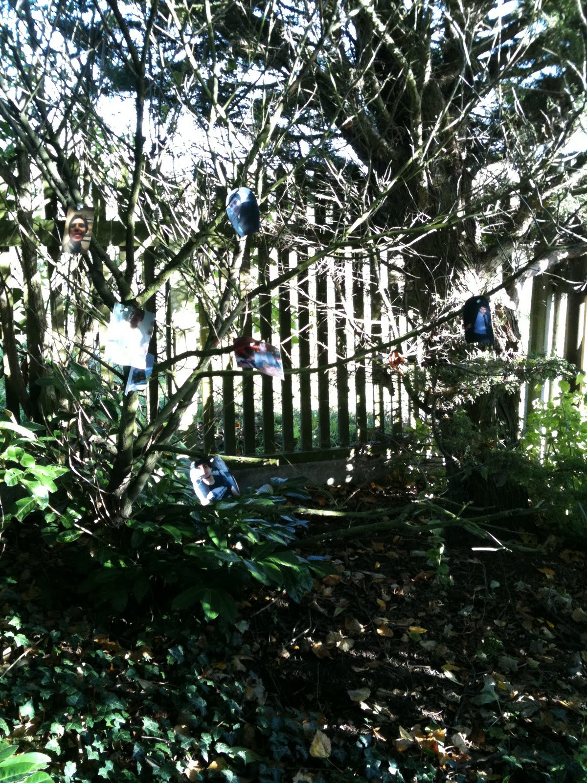
These are the pictures we used to pin to the tree. This was used to create the 'shrine' the Katie creates surrounding her ex-boyfriend Chris. They were placed so they could easily move in the wind and make it appear sinister. The pictures are of our actor Tamer Saleh, and as Chris, this pictures would be accessible to Katie from photo albums and Facebook profiles.


This is a screenshot from Halloween 2, where the fire is the main part of a scene. The impact is has is large and fills the shot, and this is what we do with our candle flame.

This is the knife we used when Katie stabs Annie in the back as she is walking. It is a kitchen knife so it would be accessible to anybody, therefore creating verisimilitude as it is realism. Kitchen knives are the most commonly used knife in horror films.

This is a screenshot from Scream (1999). It is showing just how easily accessible kitchen knives are to the characters.

These are the pictures we used to pin to the tree. This was used to create the 'shrine' the Katie creates surrounding her ex-boyfriend Chris. They were placed so they could easily move in the wind and make it appear sinister. The pictures are of our actor Tamer Saleh, and as Chris, this pictures would be accessible to Katie from photo albums and Facebook profiles.

(matches
blankets
blood
pins)
Resit - Prop Ideas
Props Ideas
These are pictures I took from websites to get an idea of the props we may wish to use, the colour and where we may be able to get them from and for what price if need be. These will help us to arrange everything before we go to film so we can film with all our props easily.
These are pictures I took from websites to get an idea of the props we may wish to use, the colour and where we may be able to get them from and for what price if need be. These will help us to arrange everything before we go to film so we can film with all our props easily.
Resit - Final Costume
As ultimately, the aim of our piece is to follow verisimilitude as closely as possible. These are the costume we used when filming. These are everyday pieces of clothing and this so the audience feel involved when watching it as they are aware of the style of clothes they are wearing. There is a clear contrast between Katie's and Annie's clothes. Annie's are bright, colourful and fashionable showing her position in society against Katie who is wearing plain, unfashionable clothes. The juxtapostition between the costumes show the juxtaposition between the characters, and are essentially an extension of their backgrounds.

We used dirty white trainers to connote her poverty. The fact they are dirty connotes to the audience her innoce had already been slightly spoiled. We chose trainers because the laces can connote the complexity of her character, even though the white connotes the innocence and purity she should have as a teenager.

We wanted Annie's t-shirt to be yellow. Yellow connotes brightness and we thought this would be fitting as it would be a juxtaposition to the action that is going on. Furthermore, in Scream (1996) the Protagonist is wearing yellow. She also has blonde hair which also Annie has. This shows her innocence and how her bright personality is dampened and ruined.


The jeans we used we leggings and this was to show her modern day clothes and how she fits within society.

We used white plimsolls to connote her innocence. The pink is used to connote the love between their relationship and how each are intertwined. When the blood lands on her shoes, we see how her death has ruined their relationship, and as white is a prominant theme - everybodies innocence.

We decided to use white as it connotes innocence. We are aiming to show that Katie is innocence and then her innocence is tainted when she kills Annie.

We wanted to use black jogging bottoms to show her poverty. With black connoting danger and secrets, this is fitting to Katie's character as conclusively, we see she is a dark character with dark motives.

We wanted to use black jogging bottoms to show her poverty. With black connoting danger and secrets, this is fitting to Katie's character as conclusively, we see she is a dark character with dark motives.

We used dirty white trainers to connote her poverty. The fact they are dirty connotes to the audience her innoce had already been slightly spoiled. We chose trainers because the laces can connote the complexity of her character, even though the white connotes the innocence and purity she should have as a teenager.

We wanted Annie's t-shirt to be yellow. Yellow connotes brightness and we thought this would be fitting as it would be a juxtaposition to the action that is going on. Furthermore, in Scream (1996) the Protagonist is wearing yellow. She also has blonde hair which also Annie has. This shows her innocence and how her bright personality is dampened and ruined.


The jeans we used we leggings and this was to show her modern day clothes and how she fits within society.

We used white plimsolls to connote her innocence. The pink is used to connote the love between their relationship and how each are intertwined. When the blood lands on her shoes, we see how her death has ruined their relationship, and as white is a prominant theme - everybodies innocence.

Wednesday, 24 November 2010
Resit - Costume Ideas
Costume
These are images I have taken from websites that show the kind of costume we would like for each character. They include justifications for the reason we would like to use them. This will help us when filming as we will have everything arranged and we can film straight away.
These are images I have taken from websites that show the kind of costume we would like for each character. They include justifications for the reason we would like to use them. This will help us when filming as we will have everything arranged and we can film straight away.
Thursday, 18 November 2010
Resit Target Audience Red font is new
Target Audience
This is the target audience profile, we researched certain audiences and areas such as film classifications so that we could appeal to exactly the right audience. Due to the disturbing and explicit murdering scenes we had to out a certificate of 15 on our film.
This is the target audience profile, we researched certain audiences and areas such as film classifications so that we could appeal to exactly the right audience. Due to the disturbing and explicit murdering scenes we had to out a certificate of 15 on our film.
Monday, 1 November 2010
Resit - Title Sequence Research
Titles play a big part in the opening of a film, some titles introduce the storyline others just add a very unique twist to keep the audiences attention because it is the first thing they see when watching a film.
Titles are very important as they introduce the people in and behind the production of the film. There is a specific way people are listed in the titles therefore I have done research on the opening of films to find out who is listed and when they are:
In Catch Me If You Can these are the title listings in the exact order.
1. Institution Presents
2. Another institution
3. Another Institution
4. Another Institution
5. Main Actor
6. Another Main Actor
7. Title of the film
8. Minor actors
9. Minor actors
10. Minor actors
11. Minor actors
12. Casting by and Casting associate
13. Co-producer
14. Based upon the book by
15. Music by
16. Costume designer
17. Film editor
18. Production designer
19. Director of photography
20. Co-executive producer
21. Executive producers
22. Executive producers
23. Produced by
24. Screen play by
25. Directed by
Casino Royale title sequence order:
1.Institution
2.Main Actor
3.Main Character
4.Name of the film
5.Actors
6.Actors
7.Actors
8.Actors
9.Actors
10.Actors and Stunt man
11.Actor
12.Actor and character
13.Associate Producer and Production executive
14.Camera operator,second unit assistant director,script supervisor, publicity and marketing, promotions and assistant producer.
15. Sound recordist, electrical supervisor, stills photography, make-up supervisor, hairdressing supervisor and wardrobe supervisor
16.visual effects and miniature supervisor, supervising art director, property master, construction manager, post production supervisor
17.unit production manager, second unit production manager, first assistant director
18.casting and stunt coordinator
19.special effects and miniature effects supervisor, main title designed by
20.second unit director
21.costume designer
22.editor
23.director of photograpghy
24.production designer
25.Music by
26.executive producer
27.based on the novel by
28.screen play by
29.produced by
30.directed by
Aliens title sequence
1.Institution
2.Institution
3.Main actor
4.Main actor
5.Main actor
6.Main actor
7.Main actor
8.Minor actors
9.Name of the film
10.Executive producers
11.Music composed by
12.Alien effects created by
13.Certain visual effects by
14.Visual effects supervisor and visual effects supervisor post production
15.Editor
16.Production designer
17.Director of photography
18.story by and based on characters created by
19.screen play by
20.produced by
21.directed by
Title sequence of SE7EN
1.Institution
2.Another institution
3.Another institution
4.Main actor
5.Main actor
6.Title of the film
7.Main actor
8.Main actor
9.Main actor
10.Main actor
11.Main actor
12.Minor actor
13.Minor actor
14.Minor actors
15.Minor actors
16.Minor actors
17.Casting by
18.Music by
19.Costume designed by
20.Edited by
21.Production design by
22.Director of photograpghy
23.Co-producers
24.Co-executive producers
25.Executive producers
26.Written by
27.Produced by
28. Directed by
After researching these big title sequences and other title sequences I have discovered despite the different genres the titles genuinlly run in the same order. Some films have more titles than others for example Casino Royale had lists of names on the same title page. The main similarity I have found is that the majority of films have the Insitution/institutions names first then they have the main actors names/or name then they reveal the title of the film. This is because the titles in the opening of a film are used to introduce the film and get the audience familar with the actors, storylines, style and genre of the film. However, a trailers title sequence is aiming to reveal the film therefore leaving the name of the film for the end of the film.
This pattern in titles will help us when we put titles on our own film. However, we will not use animation like Catch Me if you Can because we only have 2minutes to explain the storyline and display titles. So we will use titles over the filmed footage of our opening.
Resit - Dawn of the Dead Title Sequence
http://www.youtube.com/watch?v=6TuqA7I7LLk&feature=related
(Embedded was disabled)
This titles start with a black background and red writing. Immediately, this takes the form of generic signifiers within horrors as red denotes blood and death and the connotations of black are secrecy and danger and this is the impression we recieve as a viewer. The first of these title pages states the production company, this is always the case in title sequences. Between each of these title pages is a piece of footage, which another title always follows.
There is a close up of a face covered in blood. This denotes something has happened to the character. This also creates a sense of fear within the audience as the face is reocurring. We then see the titles, which follow the same format of red writing on a black background, and this is kept continuous. It is here the non-diegetic screaming is then introduced, along with sections of extra-diegetic dialouge. We hear about "the virus" and this begins to piece together the narrative, although the narrative is never fully given away. It then follows a pattern switching from the close up of the face, to a title featuring cast, with a piece of background information. This information is building up the narrative enough to keep the audience hooked and interested.
Following this, we see a continuous run through of footage which is fragments of the narrative, but isn't clear enough that the audience are aware of the full narrative. The lyrics of the non-diegetic song which is playing over all the footage reflects the action we are seeing.
Resit Catch Me If You Can- Title sequence analysis
The opening begins with a blue background with a black animated institution name revealed then a black animated man is revealed and walks across then he stops and starts creeping across, as white animated planes and air hostesses walk out this denotes the man is in an airport. This animated title beginning outlines a location which could be important, and the name Catch Me If You Can implies that a character is running from someone therefore the setting of an airport relates to the title because they are fleeing from a country. Also because the black male figure denotes suspicious movements it implies that he is the main character so the audience have already been introduced to a character and their characteristics and a setting. When the animation is in the airport there is another main character introduced, they are wearing a hat connoting superiority also the main actors name is introduced when the character is introduced which implies that this actor plays the superior man. The name of the film is then introduced the music keeps the same upbeat tone and same fast pace so the title fits in well with the action happening in the animation because the suspicious man has run away from the superior man.
The animation then moves locations from the airport to the road, there are cars but there is one specific car going fast and leaving skid marks this connotes the theme of panic and chasing which is present in the film. The location then changes again, this time the colour scheme changes too with a bright yellow background connoting sun and denoting a holiday. There is a man swimming in the pool being watched by the superior man. This implies the changed in location and the continuation of the chase. In addition, the pace and sound of the music changes to a relaxed jazz this connotes the relaxed atmosphere of the holiday which is ruined by the superior man, as the man swimming flees and changes costume to a doctor. This change of costume implies that the man fleeing has different occupations to fit around he's hiding. Then as the doctor gets into the lift the colour scheme changes again this constant change in colour and costume displays the different themes and chaotic storyline. The music also goes back to the pace it was at at the beginning with a less of a Jazz genre.
The colour scheme then turns to red and orange then to red and black. The colour red connotes danger and murder which foreshadow themes in the film also as the animation turns completely red, black and white the music builds in pace and volume connoting large scale of frustration and panic.
After the red and black colour scheme there is a pink and black colour scheme the colour pink has connotations of femininity and flirtatiousness, this highlights to the audience that there might be the theme of love entwined in the chasing storyline. The animation then builds in pace with different coloured lights flashing on and off with the different men being lit up then running on and continuing the search. This builds tension in the audience member as the pace is built and the audience will understand that the storyline gets pacey and quick therefore making them intrigued and waiting for the film to begin.
Lastly the animation finishes with both the men running as the superior man gets closer to the man on the run the animation fades to black, this leaves the audience with a cliff hanger as to whether the man gets caught.
This type of title sequence is very complex as it tells the story in the beginning two minutes. However, it makes it clear that there is a man on the run and he is changing occupations whilst on the run but it does not explain why he is running. This would therefore make the audience active and make them want to watch the rest of the film.
Subscribe to:
Comments (Atom)